Warm White vs. Cool White: Choosing the Right Color Temperature for Landscape Lighting
Two identical fixtures aimed at the same tree can look completely different depending on one setting: color temperature. Measured in Kelvin (K), color temperature is what makes light feel warm and inviting or cold and clinical — and getting it right is one of the biggest differences between a professional landscape lighting design and a DIY job that looks 'off.' Here's how color temperature works and how we choose it for homes across Hoschton, Braselton, Dacula, and North Georgia.
What color temperature actually means
Color temperature describes the hue of white light on a scale of Kelvin. Lower numbers (around 2200K–2700K) produce a warm, amber, candle-like glow. Mid values (around 3000K) are a clean, natural warm white. Higher numbers (4000K and up) shift toward a cool, bluish 'daylight' white. It has nothing to do with brightness — a dim light can be cool and a bright light can be warm; temperature is purely about the color of the white.
Why warm white wins for most landscapes
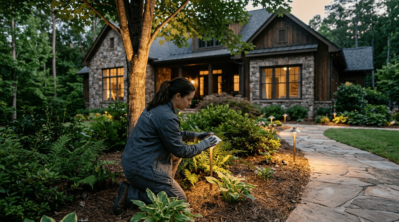
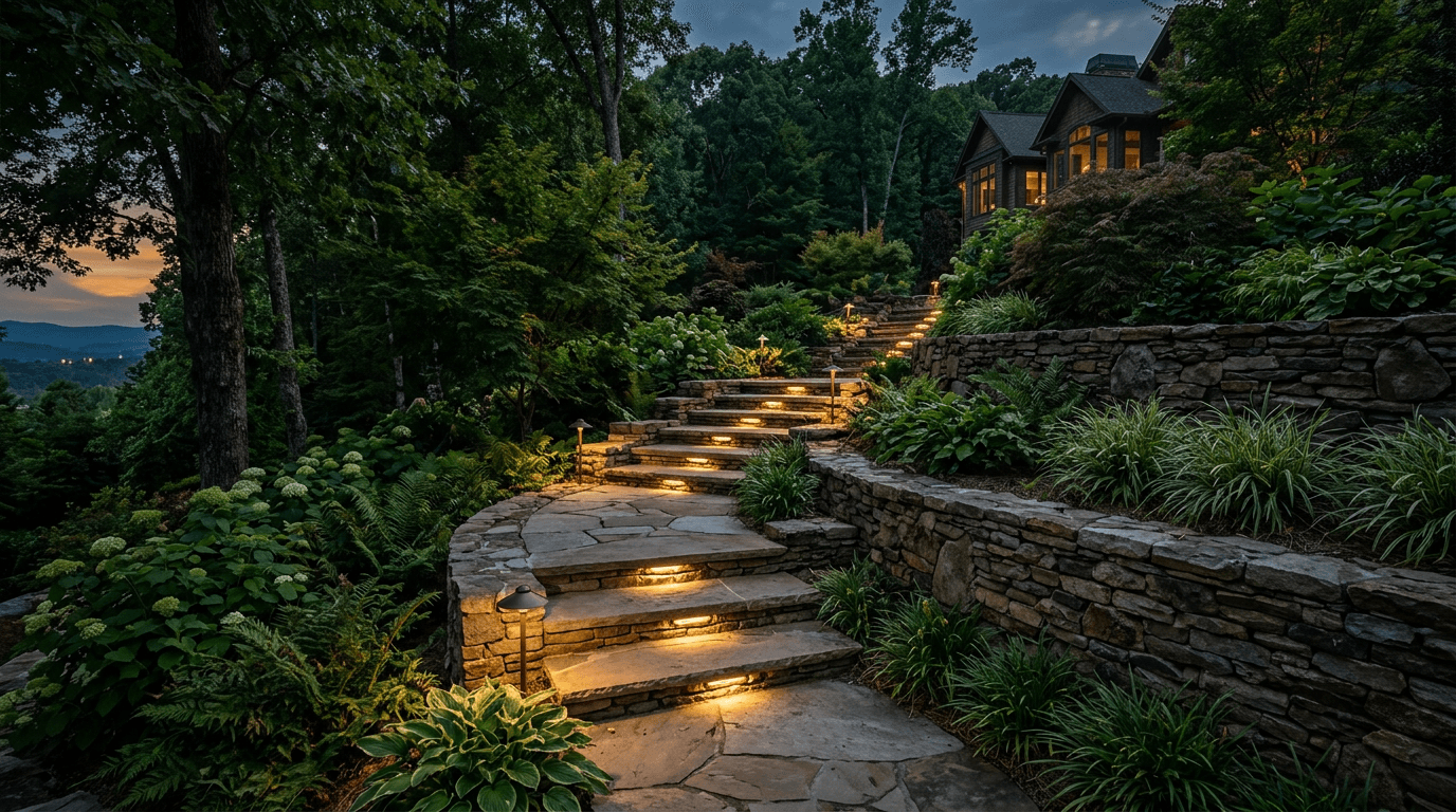
For residential landscape and architectural lighting, warm white in the 2700K–3000K range is the sweet spot. It's flattering on brick, stone, stucco, and wood, it feels welcoming rather than commercial, and it reads as elegant from the street. Cooler temperatures (4000K+) can make a beautiful home look like a parking lot or gas station — harsh, blue, and unwelcoming. Most HOAs across North Georgia also prefer or require warm tones for exactly this reason.
As a default, 2700K is our go-to for a cozy, high-end look, with 3000K as a slightly crisper option some homeowners prefer on very white or gray facades.
When cooler light has a place
There are a few intentional exceptions. Cooler temperatures around 3500K–4000K can beautifully mimic natural moonlight when downlighting from high in a tree — a technique called moonlighting — casting realistic, dappled shadows. Cooler light can also make the green of certain foliage and evergreens pop. The key is that it's a deliberate design choice for a specific effect, not the default for the whole yard.
Match temperature to the material and plant
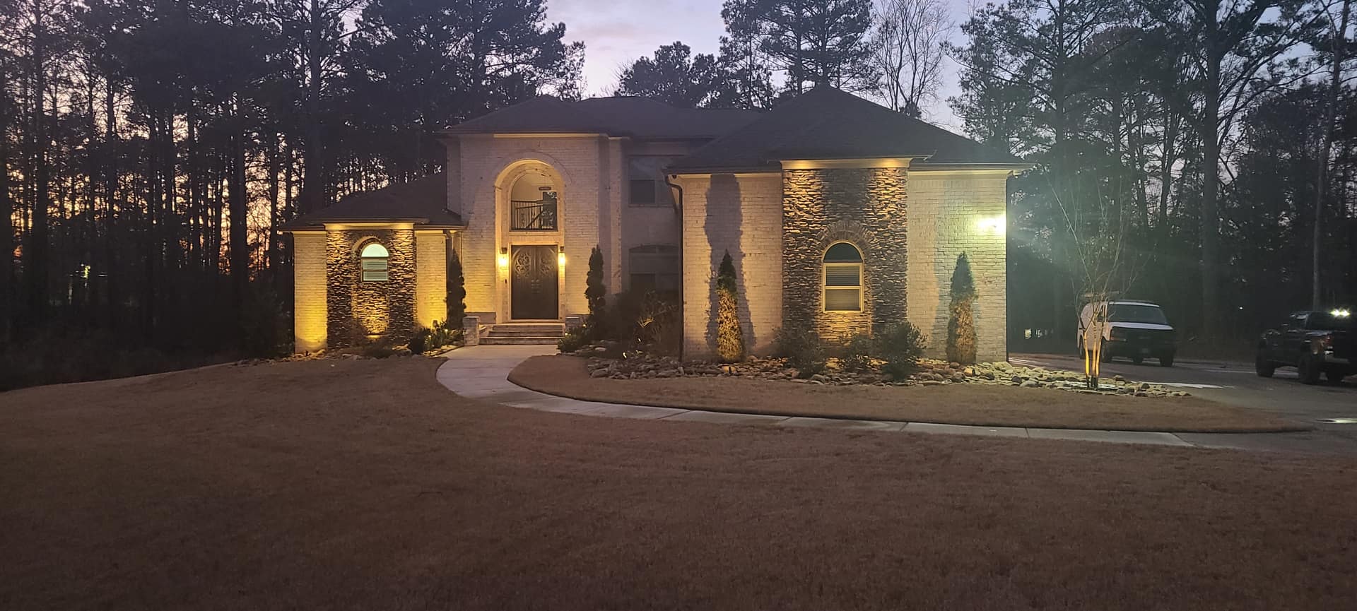
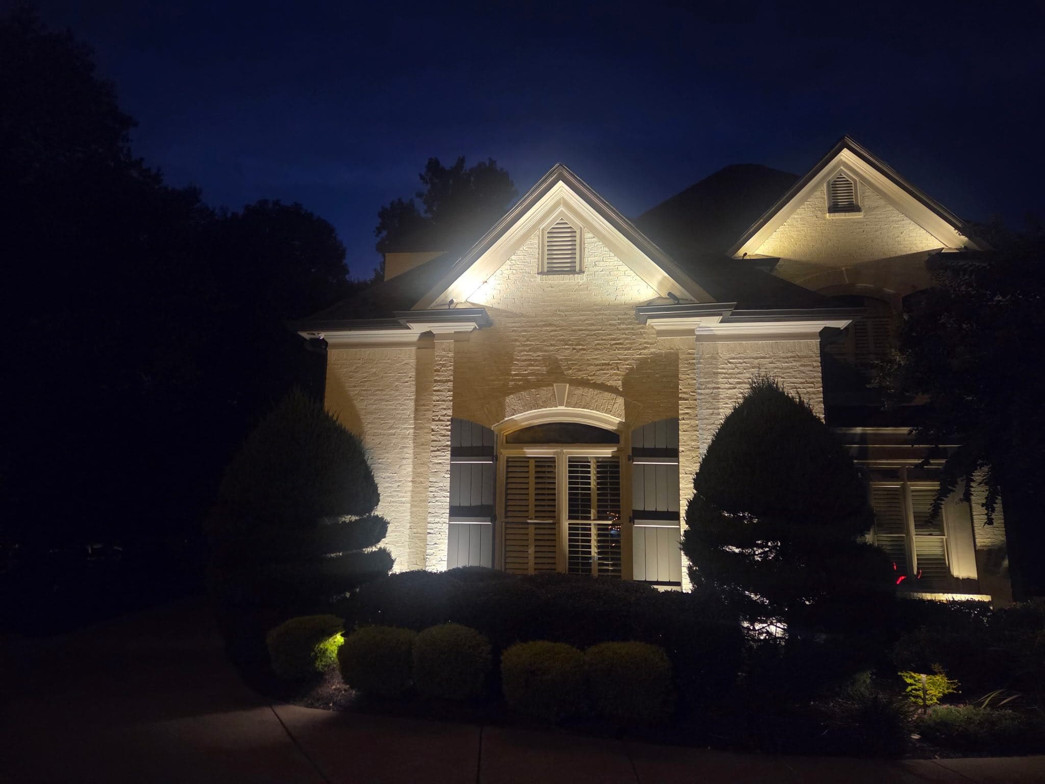
Great designers tune temperature to what's being lit. Warm 2700K light enriches warm-toned brick, tan stone, and wood, making them glow. Slightly cooler light can flatter cool gray stone and modern white facades. For plants, warm light enhances fall colors, bark, and flowers, while a touch cooler light can intensify green foliage. Using thoughtfully chosen temperatures — rather than one random bulb color — is what makes a design feel cohesive.
Keep it consistent — and beware cheap bulbs
One of the most common DIY mistakes is mixing color temperatures across a yard, so one tree looks amber and the next looks blue. A professional system uses consistent, high-quality LEDs with a high color rendering index (CRI) so colors look true and every fixture matches. Budget big-box bulbs often vary from unit to unit and shift color as they age — which is exactly why a coordinated, quality system looks so much better over time.
See the difference on your own home
The best way to understand color temperature is to see it on your own facade and landscape at night. We include a lighting demonstration so you can compare warm tones on your brick, stone, and trees before anything is installed. Schedule a free consultation and we'll help you dial in the perfect glow for your North Georgia home.